

The form settings in Accurate Video makes it possible to create custom metadata forms for timeline markers, assets and their video-, audio- and subtitle files. This can be used for a wide array of use cases, such as: Reduce the amount of metadata fields to only what is needed, use different sets of metadata fields for different rows in the timeline, or to create advanced metadata forms that fit complex business requirements.
Creating new forms settings can generally be broken down into three steps: 1. Define the metadata format using a json schema 2. Define the layout of the form with a UI schema 3. Declare which form should be used for a marker track, assets, videos, audio or subtitles.
The full documentation for the json forms settings can be found here: accurate.video/docs/install-setup/frontend-configurations/#forms
Below are a couple of examples following the outline described above.
First up, a basic setup with a single metadata field which apply for all markers.
Defining the metadata format for this example is fairly straightforward. The root element always has to be an object, all metadata fields are defined as properties on this object. For this example there will be a single field which will be called "exampleField" and it will be a string.
The key defaultMarker is used for the form in this example, the form with this key is used for all markers by default.
You can read more about the available types here: json-schema.org/understanding-json-schema/reference/type.html Add the following to the root object in settings file:
{
  "forms": {
    "defaultMarker": {
      "schema": {
        "type": "object",
        "properties": {
          "exampleField": {
            "type": "string"
          }
        }
      }
    }
  }
}The Next step is to define how the form should look like, this is done by defining a uischema object together with the schema object created in the previous step. Forms are made up of controls and layouts, controls represent the actual inputs for the metadata fields and layouts to define how those controls are laid out on the screen.
The root element has to be a layout element, a VerticalLayout will be used in this example which will cause the controls to be laid out vertically in the form. A control for the exampleField can then be added to the elements array of the layout. The label field on the control is used to define a human readable label to be displayed on the control. The scope field tells the control which metadata field it should correspond to, note how its value corresponds to the structure in the schema defined in the previous step.
Read more about available layout elements here: jsonforms.io/docs/uischema/layouts Combining the
uischemawith the previous step results in the following:
{
  "forms": {
    "defaultMarker": {
      "schema": {
        "type": "object",
        "properties": {
          "exampleField": {
            "type": "string"
          }
        }
      },
      "uischema": {
        "type": "VerticalLayout",
        "elements": [
          {
            "type": "Control",
            "label": "Example data",
            "scope": "#/properties/exampleField"
          }
        ]
      }
    }
  }
}When there is only a single form that is to be used for all markers there is no need to deal with row assignment. There will be more information on how to do this in the next example.
This should result in a settings file that looks something like this:
{
"forms": {
"defaultMarker": {
"schema": {
"type": "object",
"properties": {
"exampleField": {
"type": "string"
}
}
},
"uischema": {
"type": "VerticalLayout",
"elements": [
{
"type": "Control",
"label": "Example data",
"scope": "#/properties/exampleField"
}
]
}
}
}
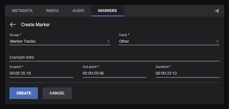
}The resulting form should look something like:
This example explains how to set up the player with two different forms, one simple form with a single field and a more complex form with some validation rules that's assigned to markers on a specific row.
Multiple forms can be defined by adding several objects to the forms array, it is important to assign unique id fields so that they can be referenced later.
The first form will contain a single name field, the second form will contain two fields with some validation rules. maxlength limits the maximum length for the string value of issue, and enum limits the values that the type field can take on to "audio", "video" or "subtitles".
The required field in the schema can be used to mark a set of metadata fields as required, users will not be able to leave those fields empty in the form.
Note that the key issueForm is used for the second form, this will be referenced in step 3.
More information about string validation rules can be found here: json-schema.org/understanding-json-schema/reference/string.html Add the following to the settings file:
{
  "forms": {
    "defaultMarker": {
      "schema": {
        "type": "object",
        "properties": {
          "name": {
            "type": "string"
          }
        }
      }
    },
    "issueForm": {
      "schema": {
        "type": "object",
        "properties": {
          "issue": {
            "type": "string",
            "maxlength": 16
          },
          "type": {
            "type": "string",
            "enum": ["audio", "video", "subtitles"]
          }
        },
        "required": ["type"]
      }
    }
  }
}A uischema has to be added to both of the forms of this example. The HorizontalLayout in the second form will cause controls to be laid out horizontally in the form, layouts can contain other layouts so it's possible to combine them to group controls in various ways.
As with the previous example the label adds human readable labels to controls and the scope field connects controls to a metadata fields.
Some metadata types support alternative input controls. Metadata fields with the enum keyword use a dropdown by default, that can be changed to display as radio buttons or an autocomplete instead using the format option on the control.
With uischema added to the forms the settings should look like this:
{
  "forms": {
    "defaultMarker": {
      "schema": {
        "type": "object",
        "properties": {
          "name": {
            "type": "string"
          }
        }
      },
      "uischema": {
        "type": "VerticalLayout",
        "elements": [
          {
            "type": "Control",
            "label": "Name",
            "scope": "#/properties/name"
          }
        ]
      }
    },
    "issueForm": {
      "schema": {
        "type": "object",
        "properties": {
          "issue": {
            "type": "string",
            "maxlength": 16
          },
          "type": {
            "type": "string",
            "enum": ["audio", "video", "subtitles"]
          }
        },
        "required": ["type"]
      },
      "uischema": {
        "type": "HorizontalLayout",
        "elements": [
          {
            "type": "Control",
            "label": "Issue",
            "scope": "#/properties/issue"
          },
          {
            "type": "Control",
            "label": "Issue type",
            "scope": "#/properties/type",
            "options": {
              "format": "radio"
            }
          }
        ]
      }
    }
  }
}The form with the key defaultMarker is used for all markers unless something else is specified, as with this example it can still be specified for clarity.
There is a lot that goes into marker definitions but what is important here is the row form field which controls which form gets used for markers on that row, and the tooltip getters which are used to create tooltips based on the metadata of markers.
{
  "markers": {
    "groups": [
      {
        "match": (marker, track) => marker?.type === "Manual" || track?.type === "Manual",
        "title": "Manual",
        "id": "Manual",
        "alwaysShow": true,
        "allowCreateTrack": true,
        "trackType": "Manual",
        "rows": [
          {
            "match": (marker) => marker?.metadata.get("trackId") === "av:track:video:issue",
            "track": "av:track:video:issue",
            "title": "Notes",
            "markerType": "Manual",
            "order": 0,
            "markerStyle": { backgroundColor: "var(--AP-PRIMARY)" },
            "form": "defaultMarker",
            "tooltip": (marker) => marker.metadata.get("name"),
          },
          {
            "match": (marker) => marker?.metadata.get("trackId") === "av:track:video:default",
            "track": "av:track:video:default",
            "title": "Issues",
            "markerType": "Manual",
            "order": 1,
            "markerStyle": { backgroundColor: "var(--AP-WARNING)" },
            "form": "issueForm",
            "tooltip": (marker) => marker.metadata.get("type") + " issue: " + marker.metadata.get("issue"),
          }
        ]
      }
    ]
  }
}This should result in a settings file that looks something like this:
{
"forms": {
"defaultMarker": {
"schema": {
"type": "object",
"properties": {
"name": {
"type": "string"
}
}
},
"uischema": {
"type": "VerticalLayout",
"elements": [
{
"type": "Control",
"label": "Name",
"scope": "#/properties/name"
}
]
}
},
"issueForm": {
"schema": {
"type": "object",
"properties": {
"issue": {
"type": "string",
"maxlength": 16
},
"type": {
"type": "string",
"enum": ["audio", "video", "subtitles"]
}
},
"required": ["type"]
},
"uischema": {
"type": "HorizontalLayout",
"elements": [
{
"type": "Control",
"label": "Issue",
"scope": "#/properties/issue",
},
{
"type": "Control",
"label": "Issue type",
"scope": "#/properties/type",
"options": {
"format": "radio"
}
}
]
}
}
},
"markers": {
"groups": [
{
"match": (marker, track) => marker?.type === "Manual" || track?.type === "Manual",
"title": "Manual",
"id": "Manual",
"alwaysShow": true,
"allowCreateTrack": true,
"trackType": "Manual",
"rows": [
{
"match": (marker) => marker?.metadata.get("trackId") === "av:track:video:issue",
"track": "av:track:video:issue",
"title": "Notes",
"markerType": "Manual",
"order": 0,
"form": "defaultMarker",
"tooltip": (marker) => marker.metadata.get("name"),
"markerStyle": { backgroundColor: "var(--AP-PRIMARY)" },
},
{
"match": (marker) => marker?.metadata.get("trackId") === "av:track:video:default",
"track": "av:track:video:default",
"title": "Issues",
"markerType": "Manual",
"order": 1,
"form": "issueForm",
"tooltip": (marker) => marker.metadata.get("type") + " issue: " + marker.metadata.get("issue"),
"markerStyle": { backgroundColor: "var(--AP-WARNING)" },
}
]
}
]
}
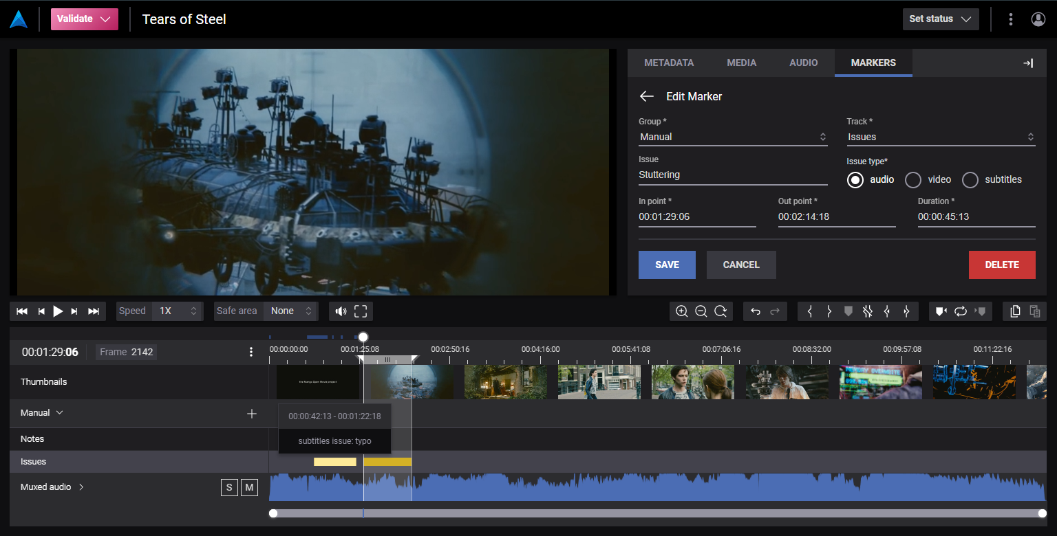
}This is how the resulting player will look like:
We start off by defining a form under the forms key. Here we give our form the id assetMetadataForm and we define three properties that we want to be able to edit: title and description, genre.
You can read more about the available types here: json-schema.org/understanding-json-schema/reference/type.html Add the following to the root object in settings file:
{
  "forms": {
    "assetMetadataForm": {
      "schema": {
        "type": "object",
        "properties": {
          "title": {
            "type": "string"
          },
          "description": {
            "type": "string"
          },
          "genre": {
            "type": "string",
            "enum": [
              "Action",
              "Drama",
              "Horror",
              "Comedy",
              "Thriller",
              "Western"
            ]
          }
        }
      }
    }
  }
}The Next step is to define how the form should look like, this is done by defining a uischema object together with the schema object created in the previous step.
Read more about available layout elements here: jsonforms.io/docs/uischema/layouts Combining the
uischemawith the previous step results in the following:
{
  "forms": {
    "assetMetadataForm": {
      "schema": {
        "type": "object",
        "properties": {
          "title": {
            "type": "string"
          },
          "description": {
            "type": "string"
          },
          "genre": {
            "type": "string",
            "enum": [
              "Action",
              "Drama",
              "Horror",
              "Comedy",
              "Thriller",
              "Western"
            ]
          }
        }
      },
      "uischema": {
        "type": "VerticalLayout",
        "elements": [
          {
            "type": "Control",
            "label": "Title",
            "scope": "#/properties/title"
          },
          {
            "type": "Control",
            "label": "Description",
            "scope": "#/properties/description",
            "options": {
              "format": "textarea"
            }
          },
          {
            "type": "Control",
            "label": "Genre",
            "scope": "#/properties/genre"
          }
        ]
      }
    }
  }
}What metadata form to use for assets, videos, audio or subtitle files are configured in the Metadata View settings. You select the form you want to use under the different field sets using the form key:
{
  "metadataViews": [
    {
      "id": "defaultMetadataView",
      "name": "Default",
      "description": "The default metadata view",
      "active": true,
      "fieldSets": {
        "asset": {
          "form": "assetMetadataForm", // <-- Form selector for assets
          "readOnlyFields": [ ... ]
        },
        "videoFile": {
          "form": "videoFileForm", // <-- Form selector for video files
          "readOnlyFields": [ ... ]
        },
        "audioFile": {
          "form": "audioFileForm", // <-- Form selector for audio files
          "readOnlyFields": [ ... ]
        },
        "subtitleFile": {
          "form": "subtitleFileForm", // <-- Form selector for subtitle files
          "readOnlyFields": [ ... ]
        }
      }
    }
  ]
}This should result in a settings file that looks something like this:
{
"forms": {
"assetMetadataForm": {
"schema": {
"type": "object",
"properties": {
"title": {
"type": "string"
},
"description": {
"type": "string"
},
"genre": {
"type": "string",
"enum": [
"Action",
"Drama",
"Horror",
"Comedy",
"Thriller",
"Western"
]
}
}
},
"uischema": {
"type": "VerticalLayout",
"elements": [
{
"type": "Control",
"label": "Title",
"scope": "#/properties/title"
},
{
"type": "Control",
"label": "Description",
"scope": "#/properties/description",
"options": {
"format": "textarea"
}
},
{
"type": "Control",
"label": "Genre",
"scope": "#/properties/genre"
}
]
}
}
},
"metadataViews": [
{
"id": "defaultMetadataView",
"name": "Default",
"description": "The default metadata view",
"active": true,
"fieldSets": {
"asset": {
"form": "assetMetadataForm", // <-- Form selector for assets
"readOnlyFields": [ ... ]
},
"videoFile": {
"form": "videoFileForm", // <-- Form selector for video files
"readOnlyFields": [ ... ]
},
"audioFile": {
"form": "audioFileForm", // <-- Form selector for audio files
"readOnlyFields": [ ... ]
},
"subtitleFile": {
"form": "subtitleFileForm", // <-- Form selector for subtitle files
"readOnlyFields": [ ... ]
}
}
}
]
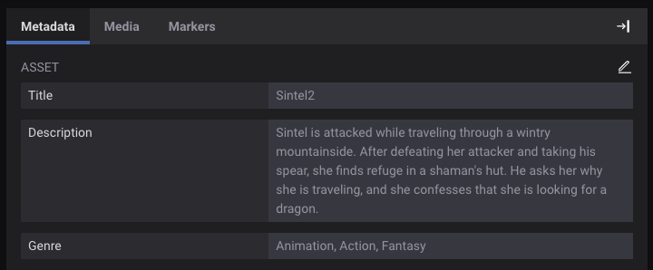
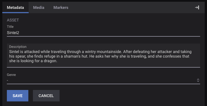
}The resulting form should look something like:
This section describes how to add custom forms to the asset status modals.
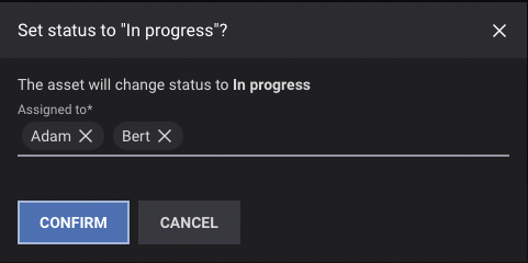
Multiple forms can be defined by adding several objects to the forms array, it is important to assign unique id fields so that they can be referenced later. This example contains three different custom forms with some validation rules.
The first form, inProgressAssetStatusForm, contains an asset_status_assignee field where the enum states which options can be selected. The required field in the schema can be used to mark a set of metadata fields as required, users will not be able to leave those fields empty in the form.
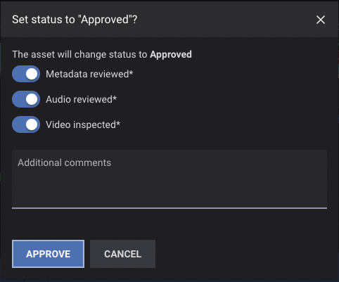
The second form, approvedAssetStatusForm, consists of the boolean toggles(asset_status_metadata, asset_status_audio, asset_status_video) that are all required and a text input that is optional. Note that when a boolean toggle is required and you want the field to only be valid for one of the toggle states you need to specify options in enum, where the non valid state is null.
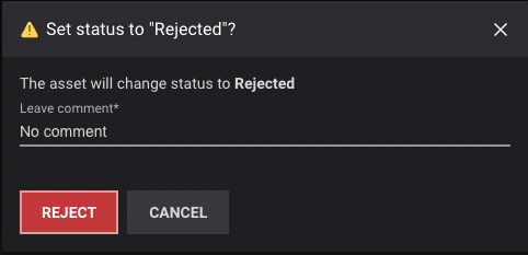
The third form, rejectedAssetStatusForm, contains a single text input that is required.
{
  forms: {
    inProgressAssetStatusForm: {
      schema: {
        type: "object",
        properties: {
          asset_status_assignee: {
            type: "array",
            items: {
              enum: ["Anna", "Bert", "Adam", "Nina", "Poro"],
            },
          },
        },
        required: ["asset_status_assignee"],
      },
    },
    approvedAssetStatusForm: {
      schema: {
        type: "object",
        properties: {
          asset_status_metadata: {
            type: "boolean",
            default: null,
            enum: [null, true],
          },
          asset_status_audio: {
            type: "boolean",
            default: null,
            enum: [null, true],
          },
          asset_status_video: {
            type: "boolean",
            default: null,
            enum: [null, true],
          },
          asset_status_comment: {
            type: "string",
          },
        },
        required: [
          "asset_status_metadata",
          "asset_status_audio",
          "asset_status_video",
        ],
      },
    },
    rejectedAssetStatusForm: {
      schema: {
        type: "object",
        properties: {
          asset_status_comment: {
            type: "string",
          },
        },
        required: ["asset_status_comment"],
      },
    },
  }
}A uischema has to be added to all of the forms. When defining the layout you can either use HorizontalLayout or VerticalLayout depending on the direction you wish your components to be laid out. Layouts can also contain other layouts which makes it possible to combine the layouts to group controls in various ways. As mentioned in previous examples the label adds human readable labels to controls and the scope field connects controls to a metadata fields. Metadata fields with the enum keyword use a dropdown by default, that can be changed to display as a multiselect for example instead using the format option on the control.
{
  forms: {
    inProgressAssetStatusForm: {
      schema: {...},
      uischema: {
        type: "VerticalLayout",
        elements: [
          {
            type: "Control",
            label: "Assigned to",
            scope: "#/properties/asset_status_assignee",
            options: {
              format: "multiselect",
            },
          },
        ],
      },
    },
    approvedAssetStatusForm: {
      schema: {...},
      uischema: {
        type: "VerticalLayout",
        elements: [
          {
            type: "Control",
            label: "Metadata reviewed",
            scope: "#/properties/asset_status_metadata",
            options: {
              toggle: true,
            },
          },
          {
            type: "Control",
            label: "Audio reviewed",
            scope: "#/properties/asset_status_audio",
            options: {
              toggle: true,
            },
          },
          {
            type: "Control",
            label: "Video inspected",
            scope: "#/properties/asset_status_video",
            options: {
              toggle: true,
            },
          },
          {
            type: "Control",
            label: "Additional comments",
            scope: "#/properties/asset_status_comment",
            options: {
              format: "textarea",
            },
          },
        ],
      },
    },
    rejectedAssetStatusForm: {
      schema: {...},
      uischema: {
        type: "VerticalLayout",
        elements: [
          {
            type: "Control",
            label: "Leave comment",
            scope: "#/properties/asset_status_comment",
          },
        ],
      },
    },
  }
}To assign a form to a specific status you need to add the form field.
{
  assetStatus: {
    statusMetadataFieldName: "asset_status",
    commentMetadataFieldName: "asset_status_comment",
    statusSetByMetadataFieldName: "asset_status_set_by",
    statuses: [
      {
        key: "in_progress",
        labels: {
          status: "In progress",
        },

        form: "inProgressAssetStatusForm", // <-- Form selector for In progress status
        color: "var(--AP-FOREGROUND-2)",
      },
      {
        key: "pending",
        labels: {
          status: "Pending",
        },
        color: "var(--AP-FOREGROUND-2)",
      },
      {
        key: "approved",
        type: "approved",
        labels: {
          status: "Approved",
          assign: "Approve",
        },
        form: "approvedAssetStatusForm", // <-- Form selector for Approve status
        color: "var(--AP-SUCCESS)",
      },
      {
        key: "rejected",
        labels: {
          status: "Rejected",
          assign: "Reject",
        },
        form: "rejectedAssetStatusForm", // <-- Form selector for Rejected status
        color: "var(--AP-ERROR)",
      },
    ],
  }
}This should result in a settings file that looks something like this:
{
  forms: {
    inProgressAssetStatusForm: {
      schema: {
        type: "object",
        properties: {
          asset_status_assignee: {
            type: "array",
            items: {
              enum: ["Anna", "Bert", "Adam", "Nina", "Poro"],
            },
          },
        },
        required: ["asset_status_assignee"],
      },
      uischema: {
        type: "VerticalLayout",
        elements: [
          {
            type: "Control",
            label: "Assigned to",
            scope: "#/properties/asset_status_assignee",
            options: {
              format: "multiselect",
            },
          },
        ],
      },
    },
    approvedAssetStatusForm: {
      schema: {
        type: "object",
        properties: {
          asset_status_metadata: {
            type: "boolean",
            default: null,
            enum: [null, true],
          },
          asset_status_audio: {
            type: "boolean",
            default: null,
            enum: [null, true],
          },
          asset_status_video: {
            type: "boolean",
            default: null,
            enum: [null, true],
          },
          asset_status_comment: {
            type: "string",
          },
        },
        required: [
          "asset_status_metadata",
          "asset_status_audio",
          "asset_status_video",
        ],
      },
      uischema: {
        type: "VerticalLayout",
        elements: [
          {
            type: "Control",
            label: "Metadata reviewed",
            scope: "#/properties/asset_status_metadata",
            options: {
              toggle: true,
            },
          },
          {
            type: "Control",
            label: "Audio reviewed",
            scope: "#/properties/asset_status_audio",
            options: {
              toggle: true,
            },
          },
          {
            type: "Control",
            label: "Video inspected",
            scope: "#/properties/asset_status_video",
            options: {
              toggle: true,
            },
          },
          {
            type: "Control",
            label: "Additional comments",
            scope: "#/properties/asset_status_comment",
            options: {
              format: "textarea",
            },
          },
        ],
      },
    },
    rejectedAssetStatusForm: {
      schema: {
        type: "object",
        properties: {
          asset_status_comment: {
            type: "string",
          },
        },
        required: ["asset_status_comment"],
      },
      uischema: {
        type: "VerticalLayout",
        elements: [
          {
            type: "Control",
            label: "Leave comment",
            scope: "#/properties/asset_status_comment",
          },
        ],
      },
    },
  },
  assetStatus: {
    statusMetadataFieldName: "asset_status",
    commentMetadataFieldName: "asset_status_comment",
    statusSetByMetadataFieldName: "asset_status_set_by",
    statuses: [
      {
        key: "in_progress",
        labels: {
          status: "In progress",
        },

        form: "inProgressAssetStatusForm", // <-- Form selector for In progress status
        color: "var(--AP-FOREGROUND-2)",
      },
      {
        key: "pending",
        labels: {
          status: "Pending",
        },
        color: "var(--AP-FOREGROUND-2)",
      },
      {
        key: "approved",
        type: "approved",
        labels: {
          status: "Approved",
          assign: "Approve",
        },
        form: "approvedAssetStatusForm", // <-- Form selector for Approve status
        color: "var(--AP-SUCCESS)",
      },
      {
        key: "rejected",
        labels: {
          status: "Rejected",
          assign: "Reject",
        },
        form: "rejectedAssetStatusForm", // <-- Form selector for Rejected status
        color: "var(--AP-ERROR)",
      },
    ],
  }
}
The resulting forms should look something like:
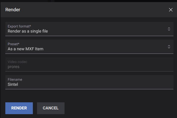
This section describes how to configure the custom form used when exporting an Accurate.Video Edit project.
We start off by defining a form under the forms key. Here we give our form the id editExportForm and we define some properties that will build up the form: render_format, preset, filename and video_codec.
You can read more about the available types here: json-schema.org/understanding-json-schema/reference/type.html Add the following to the root object in settings file:
{
  "forms": {
    "editExportForm": {
      "schema": {
        "type": "object",
        "properties": {
          "render_format": {
            "type": "string",
            "oneOf": [
              {
                "const": "flat",
                "title": "Render as a single file"
              },
              {
                "const": "file-per-layer",
                "title": "Render as one file per layer"
              }
            ]
          },
          "preset": {
            "$ref": "av://edit-presets"
          },
          "filename": {
            "type": "string"
          },
          "video_codec": {
            "type": "string"
          }
        },
        "required": [
          "render_format",
          "preset"
        ]
      }
    }
  }
}
We have two required properties: render_format and preset. These are somewhat tied to both the player implementation and the backend configuration.
The render_format controls the type of render to perform and what data is passed to the backend. You can alter the title but leave the const as-is.
The preset is a $ref that points to a different place in the settings file: settings.render.presets. Here is a snippet of the default values we provide:
{
  "render": {
    "presets": [
      {
        "label": "As a new MP4 Item",
        "metadata": [
          {
            "key": "target_tag",
            "value": "digital-mp4"
          },
          {
            "key": "transcoder",
            "value": "Vidispine"
          },
          {
            "key": "video_codec",
            "value": "h264"
          }
        ]
      },
      ...
      {
        "label": "As a new MXF Item",
        "metadata": [
          {
            "key": "target_tag",
            "value": "digital-mxf"
          },
          {
            "key": "transcoder",
            "value": "Vidispine"
          },
          {
            "key": "video_codec",
            "value": "prores"
          }

        ]
      }
    ]
  }
}
A preset controls details, like what transcoder to use and what it should produce (the target tag).
In this example, the preset also contains the video_codec that we defined in our form. So selecting a preset will change the video_codec field.
All properties you add in the form will be included as metadata in the render call to the backend.
A uischema has to be added to all of the forms. When defining the layout you can either use HorizontalLayout or VerticalLayout depending on the direction you wish your components to be laid out. Layouts can also contain other layouts which makes it possible to combine the layouts to group controls in various ways. As mentioned in previous examples the label adds human readable labels to controls and the scope field connects controls to a metadata fields. Metadata fields with the enum keyword use a dropdown by default, that can be changed to display as a multiselect for example instead using the format option on the control.
{
  "schema": {...},
  "uischema": {
    "type": "VerticalLayout",
    "elements": [
      {
        "type": "Control",
        "label": "Export format",
        "scope": "#/properties/render_format"
      },
      {
        "type": "Control",
        "label": "Preset",
        "scope": "#/properties/preset"
      },
      {
        "type": "Control",
        "label": "Filename",
        "scope": "#/properties/filename"
      },
      {
        "type": "Control",
        "label": "Video Codec",
        "scope": "#/properties/video_codec",
        "options": {
          "readonly": "true"
        }
      }
    ]
  },
}Default values can be provided, reducing the number of clicks a user has to go through.
{
  "schema": {...},
  "uischema": {...},
  "defaultValues": {
    "render_format": "flat"
  }
}
Tip: If you have a property that always has the same value, e.g. if render_format should always be flat, you don't need to define it in the uischema. Simply add a default value for the property and omit it from the uischema.
The final step is to connect the form to the export modal.
{
  "render": {
    "options": {
      "form": "editExportForm"
    }
  }
}This should result in a settings file that looks something like this:
{
  "render": {
    "options": {
      "form": "editExportForm"
    },
    "presets": [
      {
        "label": "As a new MP4 Item",
        "metadata": [
          {
            "key": "target_tag",
            "value": "digital-mp4"
          },
          {
            "key": "transcoder",
            "value": "Vidispine"
          },
          {
            "key": "video_codec",
            "value": "h264"
          }
        ]
      },
      {
        "label": "As a new MOV Item",
        "metadata": [
          {
            "key": "target_tag",
            "value": "digital-mov"
          },
          {
            "key": "transcoder",
            "value": "Vidispine"
          },
          {
            "key": "video_codec",
            "value": "h264"
          }
        ]
      },
      {
        "label": "As a new MXF Item",
        "metadata": [
          {
            "key": "target_tag",
            "value": "digital-mxf"
          },
          {
            "key": "transcoder",
            "value": "Vidispine"
          },
          {
            "key": "video_codec",
            "value": "prores"
          }

        ]
      }
    ]
  },
  "forms": {
    "editExportForm": {
      "schema": {
        "type": "object",
        "properties": {
          "render_format": {
            "type": "string",
            "oneOf": [
              {
                "const": "flat",
                "title": "Render as a single file"
              },
              {
                "const": "file-per-layer",
                "title": "Render as one file per layer"
              }
            ]
          },
          "preset": {
            "$ref": "av://edit-presets"
          },
          "filename": {
            "type": "string"
          },
          "video_codec": {
            "type": "string"
          }
        },
        "required": [
          "render_format",
          "preset"
        ]
      },
      "uischema": {
        "type": "VerticalLayout",
        "elements": [
          {
            "type": "Control",
            "label": "Export format",
            "scope": "#/properties/render_format"
          },
          {
            "type": "Control",
            "label": "Preset",
            "scope": "#/properties/preset"
          },
          {
            "type": "Control",
            "label": "Filename",
            "scope": "#/properties/filename"
          },
          {
            "type": "Control",
            "label": "Video Codec",
            "scope": "#/properties/video_codec",
            "options": {
              "readonly": "true"
            }
          }
        ]
      },
      "defaultValues": {
        "render_format": "flat"
      }
    }
  }
}
The resulting export modal should look something like:
It's possible to have markers assigned to different timeline rows based on data entered into the form, similar to how tooltips reference data from the form. For the second example it would be possible to add rows for each of the different types of issues and assign markers among them by changing the match function, like this:
match: (marker) => marker?.metadata.get("type") === "audio",Json forms has a powerful rules system which allows controls to be hidden or disabled depending on values in the underlying metadata, there's more information available about that here: jsonforms.io/docs/uischema/rules Json forms also provides a wide array of examples on how to set up different types of forms over here: jsonforms.io/examples/basic